Customers given too many choices are 10x less likely to buy
2009-06-21
For 10 years, Columbia professor Sheena Iyengar has been studying choice. For her research paper, “When Choice is Demotivating”, they ran a great test:
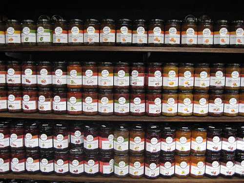
They set up a free tasting booth in a grocery store, with six different jams. 40% of the customers stopped to taste. 30% of those bought some.
A week later, they set up the same booth in the same store, but this time with twenty-four different jams. 60% of the customers stopped to taste. But only 3% bought some!
Both groups actually tasted an average of 1.5 jams. So the huge difference in buying can't be blamed on the 24-jam customers being full. :-) Lessons learned:
- Having many choices seems appealing (40% vs 60% stopped to taste)
- Having many choices makes them 10 times less likely to buy (30% vs 3% actually bought)
Surgeon Atul Gawande found that 65% of people surveyed said if they were to get cancer, they'd want to choose their own treatment. Among people surveyed who really do have cancer, only 12% of patients want to choose their own treatment.
So, if you ask your customers if they want extensive choice, they will say they do - but they really don't.
I recommend the book “The Paradox of Choice” if you're interested in this.
Where does this NOT apply?
In “preference matching” contexts, where people come looking for something they already know and prefer, extensive selection increases the likelihood they'll be successful in their search. (For example: a menu at a Chinese restaurant.)
Many tests have shown that when people are given some choice versus none (choosing between six possible activities versus being assigned an activity), having some choice increases motivation and enhances performance.
How do we use this info?
Online stores often offer too many choices on their front page. Lists of dozens of new arrivals, top sellers, sale items, and categories.
Artists showcasing their art (music, essays, photos) often present a giant list of everything they've done.
But all of us could come to these conclusions:
- Only present 3 to 6 choices at a time. (No less than 3. No more than 6.)
- Only show your deep selection when people are searching for something specific.
My favorite example of this is Firefox's about:config feature. Those hundreds of intimidating options are hidden from most people, but there for the few who need them.
I have always found too many choices to be paralyzing. Maybe what you're describing is also related to the software development concept of "analysis paralysis"? Thanks for this -- I recall reading it from you somewhere before. It was worth reading again!
When I was first learning to play guitar as a teen in the mid 80's there was an explosion of instructional materials. Hal Leonard chord books had been replaced by Hot Licks videos and Guitar For The Practicing Musician Magazine. I thought it would make things easier for a beginner like me- woodshed hard and absorb more knowledge faster, like going to an intensive course at a music school. Nope! I got competely overwhelmed, then frustrated by what I wasn't learning.
I went back to the tried-and-true method of playing along with my favorite LPs over and over, stopping to pick out important backing riffs and cool licks (not always guitar, sometimes piano or horn or vocal). I learned faster and easier this way and it was better for developing my own voice on the instrument.
i think most of us have experienced this. This is where grouping things can help the seller target specific customers...eg: a "sugar free" range of 6 jams, a "fruit loopy" range of 6 for kids, and a "traditional" range for the discerning customer. That makes 18 jams, but a customer would be more likely to identify with a group of 6 and then their choice wld be easier.
The motto? Choice is tough...more choices are even tougher
Interesting post. A great talk (20min) by the mentioned Barry Schwartz ('Paradox of Choice'):
http://www.ted.com/index.php/talks/barry_schwartz_on_the_paradox_of_choice.html
Wow. You made my day with this. Just a few months ago, I did a project on how too much choice causes, instead of liberating us, causes paralysis. Thank you for this.
I have this problem with wine selections in particular. I know precious little about wine, so seeing long wine lists tend to just intimidate me into not buying any at all. If it were a choice among three or four, I'd probably have an easier time of it.
As the saying goes, "A confused mind always says no."
Look at what it did for Apple when they simplified their line of computers...
I agree with tania, you *could* present more but you need to add some structure to reduce the choices per section.

For the curious, this TED talk of Barry Schwartz covering his Paradox of Choice material is a concise and entertaining introduction to the ideas. He's a fun character
http://www.ted.com/talks/barry_schwartz_on_the_paradox_of_choice.html
Great stuff Derek - thanks for sharing these findings!
There's a certain logic to them: as the range of available options increases, so does the likelihood that people will like more than one of those options.
People find it relatively simple to choose between things they like and things they dislike.
But it's much more difficult to choose between a number of things that are all appealing.
This quote sums it up succinctly: "sacrifice is giving up something good for something better" - from here: http://eskimon.wordpress.com/2009/06/20/the-altar-of-progress/
Could it not be possible that the jam buying population of the store had bought all the jam they needed in the first week?
Just something to look out for -- this isn't definitive proof but interesting nevertheless!
Thanks for such a great write up! I strongly suggest you and your readers listen RadioLab’s episode on Choice: http://www.wnyc.org/shows/radiolab/episodes/2008/11/14
Among other things discussed in the program, they talk about how our brains are wired to keep up to seven items in out immediate memory (our RAM, let’s say), give or take two items. And this affects choice in that, if we can’t commit all of our options to memory quickly, it becomes frustrating to compare them, and that only leads to difficulty in making a choice.
They also talk about how emotions are crucial to decision-making, to the point of suggesting that, in today’s option-ridden grocery market, a purely rational, Spock-like being would probably be incapable of making many of the choices we make in a few seconds.
"Too much" is the problem I see with a lot of technology marketing. A techie will tell you all the wonderful things a device or program will do. The average user will say, "But I just need something that will do THIS." A good example is PhotoShop. A tutorial will often overwhelm you with stuff. Most people just need a stripped down version that will do the few things they really need.
..and that is why i'm going to costco. not a large selection, but good quality - and I can return it anytime I want to if not happy.
Great! Very informative post, I'm going to use the suggestions.
Always enjoy your interesting series of posts Derek. Inspirational and educational at the same time... as it should be.
(Not trying to spam, but our website is based on this principle)
For just this reason, we came up with a website for men that don't have any choices. We carry 1 of everything, and it's the best. We thought it was pretty simple.
Cheers!
--Mr. Dude
I have always felt that this was true,and it is nice to see it is. When I managed grocery departments, we always had to be careful about how we grouped our products, so that if we had too many choices, they could be broken down into smaller options (like olive oils that had a nuttier taste, or a greener taste. Where large choices were pretty important, we placed the products near a service counter, where someone could help.
that's an awesome study...thanks...
That's only true for a time period, the novice doesn't want to have to choose between 40 types of cheeses, but the chef relishes his each of options.
Being a former engineer in hi-tech, I guess I don't fit the mainstream.
The more choices, the better for me. I will go through a process to narrow down to 10>5>3>1. Out of "X" number of choice, I feel this process gives me close to the better choice. If it's close, I'll buy choice 1 & 2. Evaluate them, then next time I will buy only the one I enjoy the best.
The other thing about choices is many folks will buy on the cheaper end; some the highest price, because they think they are getting better quality and value.
One of thing I have learned is that many store brands are just as good as major brands & most of the time they are from 25-50% cheaper.
Still a great post!!
I think this is really important at the buying stage.
@kse - it doesn't matter if WE are smarter than that, but what the fans do or don't do on our site.
I've been setting up specific landing pages with one available option, and moving/hiding lots of links so that they can only do one thing on the page. (opt-in or buy)
Agree. I learned this many years ago when I helped a friend at his tailor's shop. I looked after the menswear sales counter. People would come in to buy shirts and I would cover the counter in shirts, and they bought nothing. Then I just put 4 shirts out. If they said no to all, put all 4 shirts back, got another 4 shirts out. I then sold a lot of shirts by never having more than 4 choices on the counter
Initially I agreed with this article's thesis, but I am beginning to doubt.
How can this explain the success of Amazon.com for instance which offers dozens of items is dozens of categories. I think the key is to offer your customers the ability to narrow down choices easily such as kse the former engineer mentioned above.
The best estores allow me to sort by "best selling" and "highest rated" and also allow me to sort by price range. After I have set my price range I choose on of the first two categories and usually pick one of the first 3 results. That is how I process my purchases personally.
I certainly learned this the hard way as an artisan creating and displaying a massive inventory of one-of-a-kind floral-inspired fashion accessories.
For a long time, I displayed EVERYTHING! First I tried organizing by flower and ribbon types because it made "sense" to me and that was often how I created them (as variations on a theme). But soon learned people seldom shopped that way, but rather looked for items by color.
So, enter the "rainbow" display theory. Received many accolades for the beauty of my work and even for the display but not so many sales. Response was exactly the point made in your post, "...so beautiful, but too many to choose from." Only the most motivated would take the time and effort to sort out the options.
While a friend once told me to always give a customer something to say No to (ie, a choice so they could say Yes to the other one); in giving them too many choices, I made it too hard for the average show customer to take the time to say Yes.
As I've developed a sparser display with my deep selection readily accessible for "self-service" for those who like to "dig" without sales person hovering over them yet ready at hand for those who prefer my personal attention, my sales have increased yet there is still room for improvement.
So, I'm glad to learn about this magic "3-6 items" range. Doubt I'll ever get down to displaying no more than six altogether, but this certainly encourages me to design a series of vignette style of window displays for my booth rather than still be tempted to put out too many options for fear that someone will walk away because they don't see the one thing that might appeal to them.
Thank you!
A key element to segmentation is that you "cannot" be all things to all possible individuals. Developing your offerings should be an intentional strategic decision based on an understanding of your customers and a realistic assessment of your organization's ability to deliver (and profit) on your value promises.
Present your offerings with compelling and consistent value messaging that is in the language of your customers and that they can relate to their pain/needs/wants (and I agree with the 3 to 6 options, in many cases, but it really depends).
Important: don't assume
I totally agree. At a restaurant, when the waiter comes by to tell you specials, if there are more than 3 or 4 it is too much to absorb. Lewis Black has his own hysterical way of commenting on this: see http://www.youtube.com/watch?v=VOLFo9Aoomw
Strong language avoiders may want to avoid this video.
I thought it's common knowledge. (I learned it years ago) Just look at Apple, a company who has perfected the less is more.
That's an excellent study - I know I often suffer from "information overload" when presented with too many options!
I worked for a retailer who never had samples, and they brought some sample-person in for some promotion or whatever, to give samples of chocolate-covered cookies.
The surprising thing I noticed is that quite a few people will take the box of cookies, but then stash it in a random aisle as they pass. For weeks afterwards, I was finding boxes of those cookies in every nook and cranny in the store.
So you'd have to track them with cameras to the checkout, or make sure you only sell the product through the sampler (and then count the POS transactions).
Very interesting article. Reminded me how young children perceive the quantity of things 1,2 and lots. Which is why children's drawings often have 'lots' of fingers rather than the correct amount.
I also think too many choices degrades the perceived 'worth' of those choices.
I've long suspected this to be the case with travel sites. A long list of hotels is intimidating, but most people don't trust the filters. Probably why the conversion rate is something under 2%.
The trouble with all you people on these pages is that your profession is to make people to do what they actually do not want to do. They do not want to buy that jam in the first place, and I agree with them. But it definitely learned me a lot. Thank you, especialy for the reference to the great scientist.
Great idea that I have never thought of. It seems I am only in bands that have 1 CD so that is not the problem. However I can see how this is very important in marketing our products.
THANKS!!!
What about many choices for buying a CD?
For example, I present a CD for sale like this:
[BUY BUTTON]
Or, choose from the following
[itunes] [cd baby] [rhapsody] [napster] [emusic] [amazon]
Will this drive people away?
Great info. and I believe very true
A perfect example of this is Borders Books and Barnes And Noble. My gosh, I have actually gone in these stores, and the book lover I am, circled them aimlessley, only to walk out without touching a book as I am overwhemled by where to even begin!
I think you'd enjoy another TED Talk discussion given by Malcolm Gladwell that also discusses this concern, albeit from a slightly different angle.
i call this 'video shop syndrome.' I go to get a video with my girlfriend and an hour later we both look at each other all confused! "lets just get outa here babes." Way to many choices.
Totally depends on what you're selling and what your competition is. If you're a vendor at a swap meet and you only have 4 or 5 items to sell, it better be porn or drugs, 'cause the cowboy set up next to you who just got back from his wholesaler in Amarillo with two truckloads of Hot Topic knockoff hoodies is most definitely gonna outsell you.
This confirms what I have always suspected. Great to have research to back it up. When I set out my CD table and my now 4 CDs, I then get questions like, which do you consider the best, and a bit of time wasting, but when it's focussed with 1 or just 2, great sales !
Twenty-five years in drum retail says people who don't know product confuse easily. The sales person's job is to hack through the jungle of options and simplify the selection process for them.
"How does this relate to selling music? What about ad-ons and choices...?" This post leaves more questions than answers. Maybe that is the answer.
Leave them wanting more and let curiosity and mystery do some of the work. What is not said can be as important as what is said. When you try overselling your act, it can actually repel. Attract the audience and let their intellect meet you half way.
I never stopped and thought about this, but it makes complete sense. I can think of times when too many choices has left me staring blankly and see my customers do the same thing. I think refining the choices down for the customer will really help move some products we have struggled with until now. Thanks for the article!
Freedom of choice is what you got.

Freedom from choice is what you want.
Gotta love Devo
I am trying to extrapolate here - what if they didnt measure 'buying' but measured 'happiness' instead.
This study measured buying activity only - people actually taking out their wallets and buying the jam. What if people actually felt happier seeing 24 varieties of jam. Wont they feel more happy on seeing lots of choices, signifying a healthy and smooth economy, all indicating a bountiful, abundant, plentiful and prosperous nation. I would! I also found a flaw in this study - I made a post in my blog - http://mohanarun.com/the-paradox-of-choice-extrapolated
Truly good insight. It just occured to me that you could apply the same insight on your newest posts page and brake it down more(couple of pages of newest posts, 10 posts per page)
Interesting article and one that can be put to so may different uses in businesses. Hmm, fancy some Jam toast now. Thanks for the article!
Exactly what I've seen - too many choices in website templates, and people will go elsewhere. Getting rid of some choices means that people are more likely to decide. I simply get rid of all but the the most popular designs, and sometimes swap in something with potential. It's working.
Nice one, but I am having a problem with the menu example you gave. The situation there is different (Selection is immediate - not after a while from another shelf, leaving the place after sitting has its costs such as in social measures and is not always comfortable etc.. etc..) It is totally different from Jam at a store for so many reasons and factors.
Firefox's about:config feature is fab, It's really helpful when you have something silly like a default search engine locked in that you can't change. It helped me change the location settings in its auto search feature when I was looking for web design agencies in leicester.
Thanks
http://www.fdcstudio.co.uk
That's why I've fallen in love with Windows Phone. You don't have the option of changing everything from your background images to animations etc that are ubiquitous in Android. This leads to such a sense of relief once you accept that NOT being able to change the background of what is simply a tool, isn't the end of the world